
‘Creativity only gets you so far’: Is it time for marketers to become financially fluent?
Matthew ValentineIs a lack of financial savvy holding marketers back from ascending to the top jobs in business?
Is a lack of financial savvy holding marketers back from ascending to the top jobs in business?
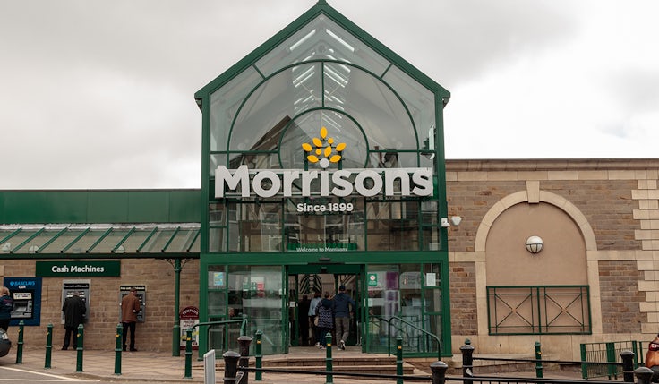
Morrisons CMO Rachel Eyre describes loyalty as a two-way street so says the supermarket must be “hyper-personalised” in its offer to get more people “voting with their feet”.

The car manufacturer built its marketing team just four months ago but has already abandoned the endeavour.

Agencies will complain pre-testing snuffs out the creative spark, but in reality it helps brands identify the best-performing ads and make them even better.
The FMCG giant is looking at “new category opportunities” as it looks to regain market share and tackle the threat of private labels.

Marketers may like to be believe they can identify with a wide range of people but, in reality, they are as likely to be led by their biases as anyone else.

The sixth CX50 list of the UK’s top 50 customer experience professionals reveals the key trends in a complex and highly regulated sector.

Some CMOs are “selfish” staying in their posts too long and not letting others progress, suggests Asahi CMO Grant McKenzie.

The rules of content marketing are evolving faster than ever – here’s why.

At the end of every week, we look at the key stories, offering our view on what they mean for you and the industry. From Elon Musk sacking Tesla’s 40-strong marketing team to McDonald’s shining a light on the power of ‘stillness’, it’s been a busy week. Here is my take.

People’s view of their personal finances improves in April but hides a general flatness to consumer confidence that is taken a while to shift.

Unilever is aiming to grow its brands through innovation that “scale and build categories”, rather than simply delivering “new news”.
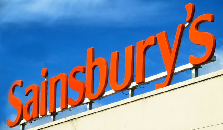
Sainsbury’s reported higher than expected profit growth and increased optimism for its Nectar loyalty proposition, which it says is strengthening its retail media offer.

Wise has driven much of its growth to date through word of mouth, but having evolved its proposition, the international banking platform believes now is the time to launch its first global brand campaign as it looks to build awareness.

While the UK’s ad market grew 6% in 2023, total growth when discounting high inflation rates was -1.2%, according to the latest report from the AA and WARC.

Inclusive marketing drives meaningfulness and differentiation for Lego, says brand boss Carolina Teixeira, measures closely linked to price inelasticity.

Marketing boss Richard Warren claims boards see advertising as a running cost, meaning marketers shouldn’t “cloak” campaigns in the word “investment”.

Not only having to deal with a gender pay gap, women in marketing are more likely to take on additional responsibility without an uplift in pay. It’s a problem with no easy solutions but bubbling frustrations.

Exclusive data from Marketing Week’s 2024 Career & Salary Survey reveals the gender pay gap for full-time workers has improved, but only by a minimal 0.5 percentage points.

With stints at LVMH, Estée Lauder and Makeup by Mario under her belt, Estrid’s first chief brand officer Nico Morga Alden’s “risk prone” approach to her career has served her well.

Women’s career progress and salaries take a dive when they become mums, not because they become less good at their job but because policies around parental leave and childcare continue to be biased.

From positivity and clarity to the need for humility, speaking to a number of top marketing leaders has revealed five common traits that all possess.

Marketers should borrow from the ‘duck-rabbit illusion’ when thinking about what their marketing plan is trying to achieve to ensure direct marketing activity isn’t compromised by an injection of emotion and brand-building campaigns aren’t undermined by focusing on product.

Women’s health is a $1trn per year opportunity yet brands are still failing to represent and communicate to women in a meaningful way.


Creative campaigns and exclusive insights from across the agency landscape.

Mars introduced a tool that uses “behavioural philosophy” to predict the impact of creative in driving sales in 2020, part of its eternally evolving effectiveness effort.

Having the right people at the heart of effectiveness programmes is the difference between succeeding and failing.

B2B marketers have long leaned on lead generation as a way to quantify their contribution to revenue, however, with many recognising it can be a blunt measure, is there a better way for marketing to showcase its contributions?

Solving the increasing burden of responsibilities on marketers doesn’t come with any easy answers. But from increasing the profession’s presence in the boardroom to changing the culture of overwork, there are things that can be done.

Marketers should cease pontificating about the validity of CMOs and their time in post, and start focusing on how to do the job better.

Five top marketers from a range of businesses share their outlook for the future of marketing leadership, from struggles with role fragmentation to the need to be deep collaborators.

High levels of inflation have forced many brands to lean on increased prices as a lever of sales growth. This year, growth will have to come from elsewhere, presenting marketers with a huge challenge.

Maintaining a balance between price and footfall growth is a “North Star” for the McDonald’s business, which hopes its growing loyalty scheme will help it further step up its pricing strategy.
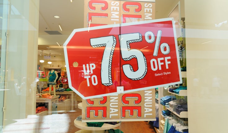
Escaping dependence on price promotions is a tough challenge, but it’s achievable with Mark Ritson’s systematic approach.


Today’s consumers are inundated with media vying for their attention, as delegates heard at this year’s Festival of Marketing. So how can cultivating ‘fandom’ help brands cut through?

True emotional connections between brands and customers boost revenue as well as retention, but marketers need an accurate understanding of the key trigger moments.

Consumer interest in eBay’s fashion offerings skyrocketed this year, thanks to a campaign from agency DEPT that bridged TikTok, TV and everything in between.